If you’re unfamiliar with the term, at least you certainly have seen this picture: a huge orange button that says “Buy Now“, a message that says “Take advantage of 2×1 until May 30“, or a large blue button under a box to enter your email and the message “Subscribe now and you will receive this free eBook“. There are more simple ones like the “More info“, “Click here“, “Contact us“, “Visit us“.
Imagine that a clothing store has all the new collection displayed in a local, with mannequins perfectly combined, the shelves and hangers full of clothes… But there are neither fitting rooms nor cash desks. You’ve been taking the clothes you like and you don’t know what to do, you can’t try them and, what is more serious, you don’t know where to pay them. It’s very difficult for this store closing sales, isn’t it?
Pues aplicamos esto a tu web. Cuando un usuario ha aterrizado en tu página, ha mirado el contenido, le ha gustado lo que ofreces, algunos artículos de tu blog… ¿Cómo termina la historia?
So let’s apply this to your website. When users have landed on your page, looked at the content, liked what you offer, some articles on your blog … How does the story end?
Give the users facilities to interact with you. Guide them! Ask them to subscribe to receive your news, or make a reservation, a purchase, try a free version of your product, take advantage of a promotion … there are a thousand actions that users can make on a web. Which is the one that suits you the most and also benefits your customers?
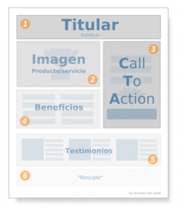
Features of a CTA
- A CTA must be aligned with one of your marketing targets (getting new subscribers, retaining customers, selling a product, publicizing some aspect of your business, etc.).
- Once you have defined the action, strategically place the CTA on the sales page. Where boxes are usually placed in a store? On the third floor, in the background on the right? Or near to the exit? Where are releases and bestsellers placed in a bookstore?
- A CTA is not just a button, it’s a crucial element when your audience has connected with your brand. You have to show them the steps to follow to get your product or service.
- Usually it is a clickable button, place it in the most visible place of the page, highly contrasted with the background and in a preferred place where there are no other distractions (do not place it next to the social networks icons). It must go immediately after the paragraph where you explain what you are interested in offering.
Checking the visual impact
I propose a method to see if a CTA, in this case framed within a Landing Page (or sales page), is visible enough and is really a CALL TO ACTION.
Stand 1 meter from the screen for every 10″ of the monitor. For instance, if the screen is 29″, stand 3 meters away.
- What do you see the most?
- If the elements that stand out most are not the headline, the CTA and the product image, check the layout of the sales page.
- Make sure the headline and call to action are readable at this distance.
- Do you identify naked eye where the call to action is, without thinking, without looking for it?
- If you have readability problems, do not forget that the cause may be not only in letter size but also in excessive styling (exotic fonts, colored backgrounds that give contrast problems, etc.).
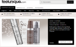
Here are some examples of CTAs that encourage action, do you see them?:


Do you have CTAs on your website? Can they be identified? Are they effective? Leave your comment!
And if you need a second opinion, send us an email.
2 Comments